The Best Color Palettes for Modern Design
Color is the first thing a visitor sees and the last thing they remember. Get it right and your product feels confident, modern, considered. Get it wrong and even great copy and layout fall flat. Most designers don't lack taste — they lack a system. This article gives you one.
The 60-30-10 rule (and why it works)
- 60% — neutral background and surfaces
- 30% — secondary color (text, borders, supporting UI)
- 10% — your bold accent (buttons, links, highlights)
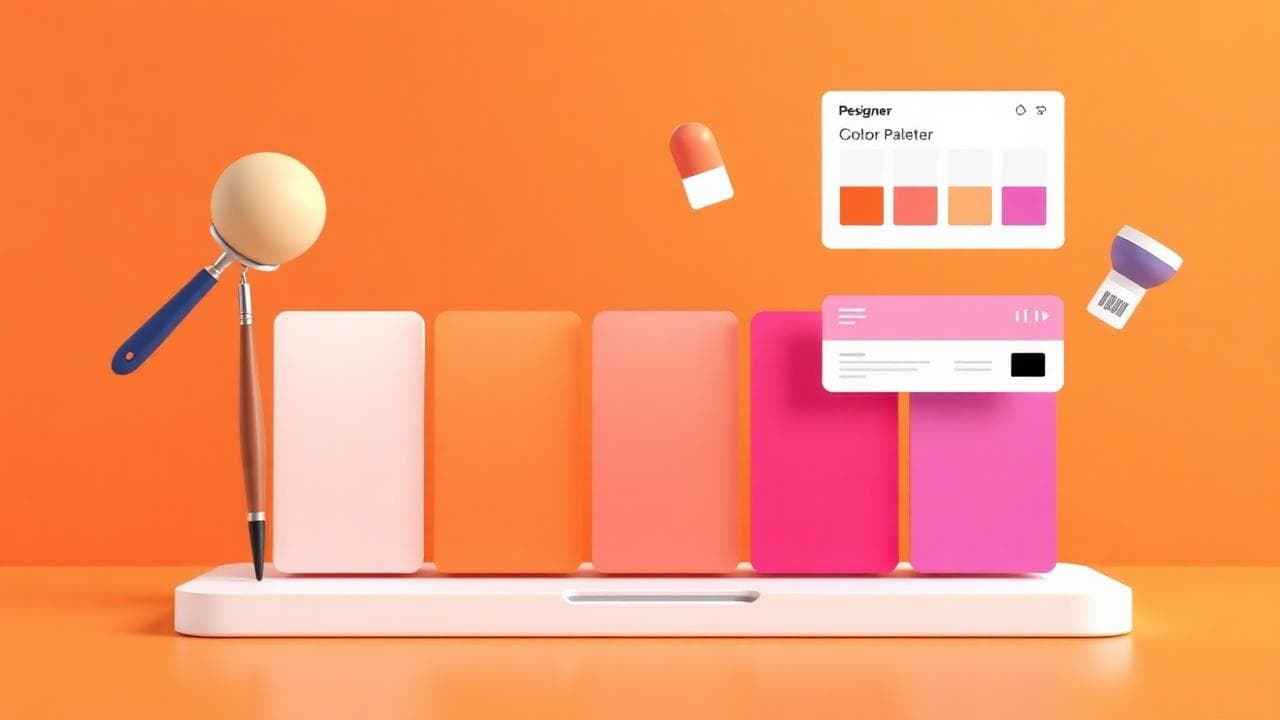
This proportion gives the eye a place to rest. Designs that fail usually invert it — accent everywhere, no quiet space. Build a palette that respects these ratios with the Color Palette Generator.
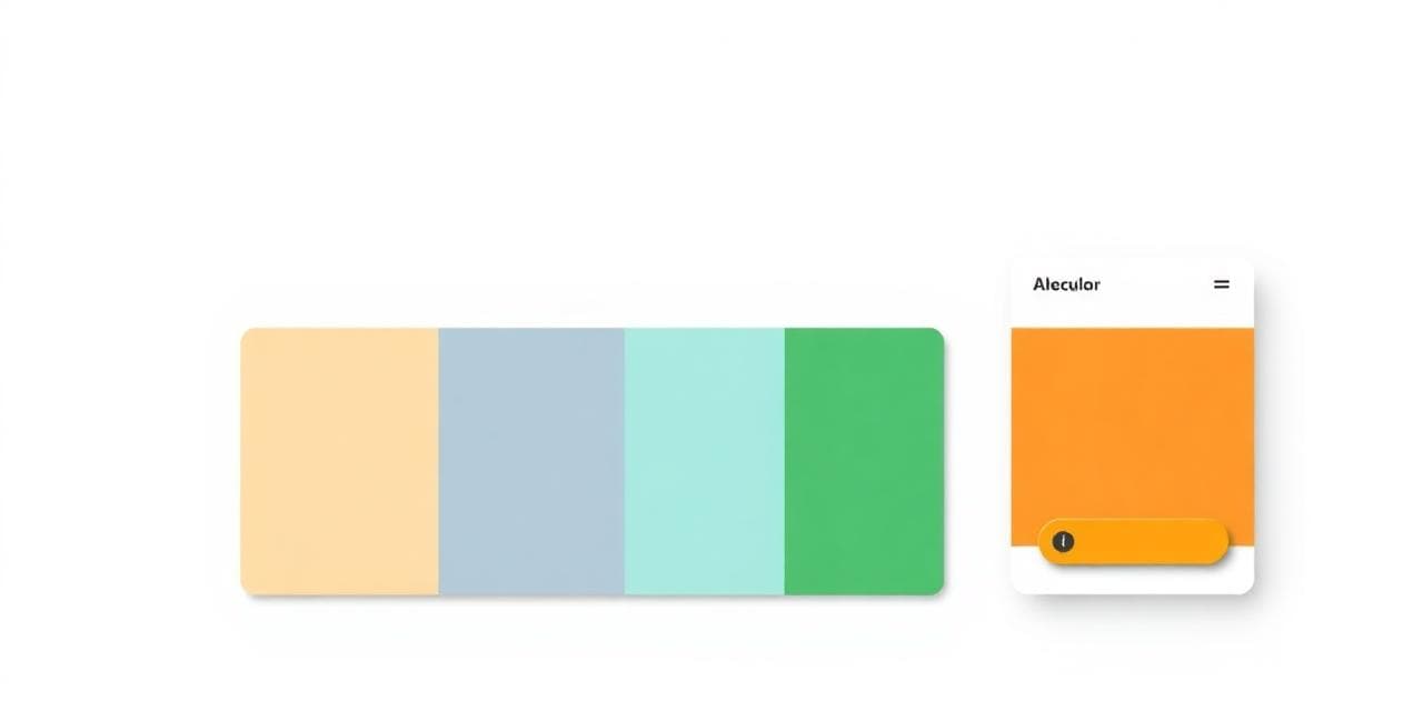
Start with one hero color, build everything from it
Pick a single brand color and build everything around it. Tints (lighter), shades (darker) and a complementary accent will cover 95% of your needs. Two colors used with intent will always beat seven used by accident.
Two colors used with intent will always beat seven used by accident.
Use gradients sparingly — make them count
One signature gradient on your hero section beats a rainbow everywhere. Modern gradients work best when they stay close in hue (e.g. blue → violet) rather than jumping across the wheel. Build yours with the CSS Gradient Generator and save them as design tokens — never re-invent the gradient on every page.
Test contrast (this is non-negotiable)
Body text must clear WCAG AA contrast (4.5:1 for normal text, 3:1 for large text). If a color fails, darken or lighten it by one step.
Five palette directions that work in 2026
- Monochrome + one accent — Linear, Vercel. Calm and confident.
- Warm neutrals — Notion, Stripe. Trustworthy and editorial.
- Dark mode first — Raycast, GitHub. Premium and developer-friendly.
- Pastel + bold accent — Figma, Framer. Playful but professional.
- High-contrast brutalism — Vercel hero pages. Confident and modern.
The pre-launch color checklist
- Pick one hero color — the rest follows
- Build tints and shades with the Palette Generator
- Test every text/background combination for WCAG AA
- Define semantic tokens (no raw hex in components)
- Pick one signature gradient with the CSS Gradient Generator
- Compress your hero images with the Image Compressor so colors load fast
Frequently Asked Questions
How many colors should a brand have?
One primary, one accent, plus 5–7 neutrals (background, surface, border, text variants). That's it. More and you'll lose consistency.
Should I use trendy colors?
Trends are great for hero gradients and marketing pages, but your core brand color should outlast trends. Pick something you'd be happy with in five years.
What's the easiest way to make a palette feel premium?
Reduce saturation and increase contrast. The most "premium" palettes are also the most restrained.
Conclusion: restraint wins
Pick fewer colors and use them with intent. Build a system, not a mood board. Open the Color Palette Generator and start with one hero color right now — the rest of your design system will fall into place.
Comments (0)
- Be the first to comment.
Ready to put this into action?
Open Color Palette Generator and try it now — free, no signup.